Aviation Safety Data Visualization
Data visualization related to aviation safety

Description
This project involve 5 data visualization tasks related to aviation safety. The repository is organized according to each task. All visualizations were created in PowerBI with the exception of one that what created in InkScape.
- Task 1 - Dashboard: Internal dashboard with visualization related to airline aviation safety measures.
- Task 2 - Executive Summary: Executive focused presentation deck highlighting aviation safety impacts to airlines.
- Task 3 - Blog Post: Externally focused blog post incorporating publically relevant visualizations relating to aviation safety.
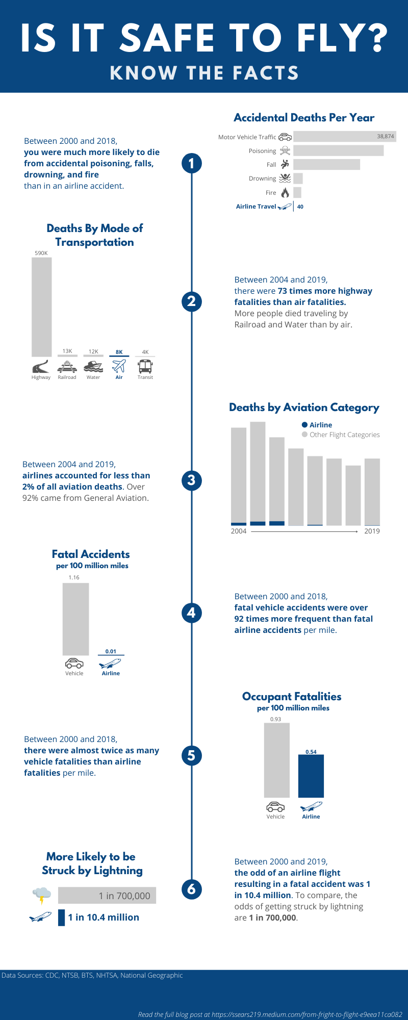
- Task 4 - Infographic (shown below): Externally focused infographic that may be found in airports with data visualizations emphasizing the facts about how safe airline flight is.
- Task 5 - Video: Externally focused animation created in Animaker again emphasizing the facts surrounding the safety of airline flight.

Data
- Covid Data
- Bureau of Transportation Saftey
- National Vital Statistics Systems - Mortality data (2018) via CDC WONDER
- National Transportation and Safety Board
- National Highway Traffic Safety Administration
Tools
- PowerBI
- PowerPoint
- Excel
- Animaker
- ScreenRec
- InkScape
Author
Samuel Sears @ssears219